Design systems that speed up product delivery
How shared components, tokens, and documentation help our teams move faster while keeping UI quality consistent.
Key takeaways
- 01
A design system is the contract between design and engineering — not just a Figma file.
- 02
Component libraries with documented variants eliminate one-off CSS on every screen.
- 03
Documentation next to code pays for itself within the first sprint.
A design system is not just a Figma library — it's the contract between design and engineering. Tokens for color, spacing, and typography ensure the shipped product matches the spec.
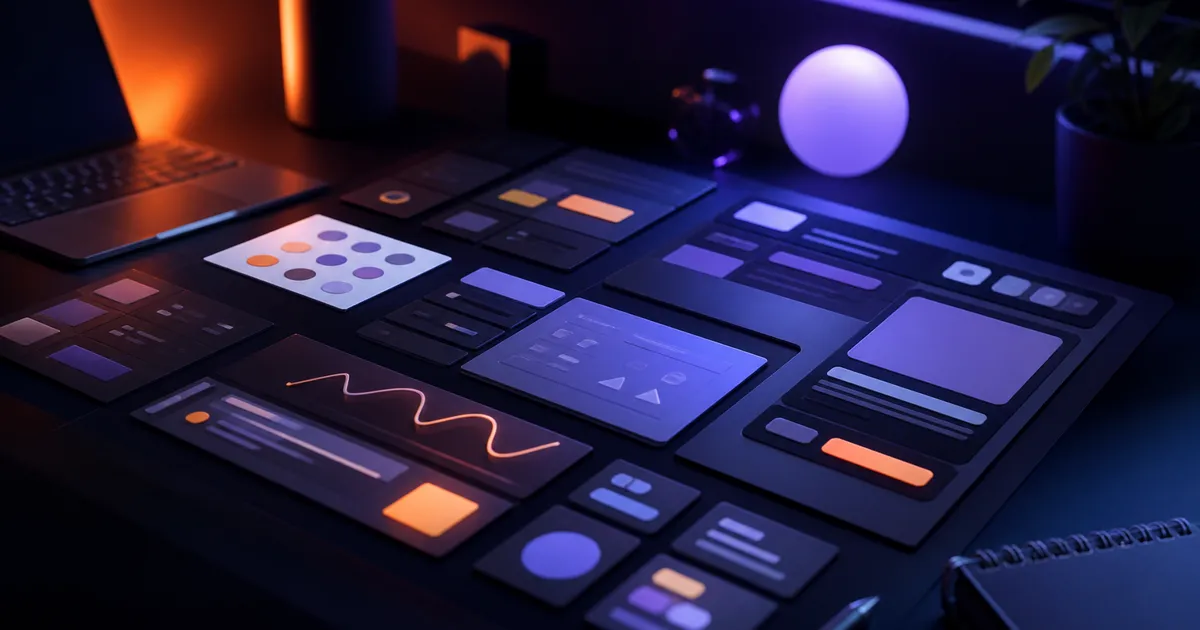
Components engineers actually use
We build component libraries in React (and Flutter where relevant) with documented variants: buttons, inputs, modals, tables. Engineers compose screens from tested pieces instead of one-off CSS.
- Semantic tokens for color, spacing, typography, and radius
- Variant-driven components: size, state, and emphasis
- Accessibility notes baked into every component spec
- Parity between Figma components and code exports
Documentation that sticks
Documentation lives next to the code: usage guidelines, accessibility notes, and do/don't examples. That onboarding cost pays off within the first sprint.
“New engineers shipped their first feature using the system on day three — no bespoke CSS review needed.”
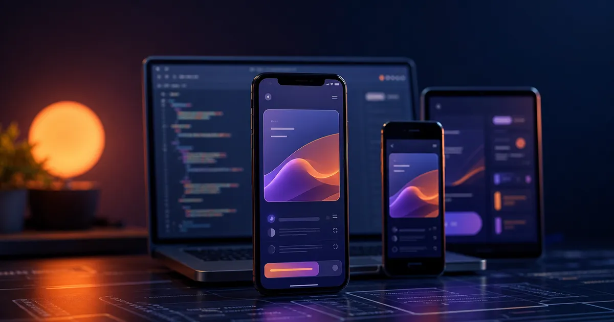
What clients gain
Clients benefit from faster iterations and a cohesive brand across web and mobile — especially when multiple squads work in parallel.
About the author
Veloria Design
Product Design
Our design team builds Figma libraries, token systems, and component specs that keep web and mobile products visually consistent from first prototype to production.


Work with us
Want to discuss this topic or build something similar?
Veloria Tech ships production-grade mobile, web, and AI products — from architecture through launch and beyond.